Create a CSS only Accordion UI

Accordion ui is used on web pages to show or hide content based on user interaction. Normally it is built with the help of any JS library or custom JS with HTML and CSS.

These days we can easily build an accordion UI just using semantic HTML and CSS. That means we don't really need any JavaScript to get this job done. Instead we make use of the <details> and <summary> HTML tags.
The <details> tag is used as a wrapper element for content that the user can open and close. The <summary> tag denotes the visible heading for the details. Both these tags support global HTML attributes.
Let us build the markup for our accordion UI.
Our HTML code
<details class="accordion_element">
    <summary class="accordion_title">
        Lorem ipsum dolor sit amet
    </summary>
    <div class="accordion_content">
        <p>Lorem ipsum dolor sit amet consectetur adipisicing elit. Corporis quidem non deleniti, laudantium ab ex!. Ullam ipsa doloribus excepturi eligendi sint. Rerum delectus laborum inventore ut quibusdam deserunt fugit tempora.</p>
    </div>
</details>
Now we will style the elements using the class attributes used in our markup.
Our CSS Code
.accordion_element {
  border: 1px solid #c4c4c7;
  margin: 5px auto;
  transition: all 200ms;
  border-radius: 5px;
  max-width: 70%;
}
.accordion_element[open] {
  background: #3872FF;
  border: 1px solid #5887f4;
  color: #fff;
}
.accordion_element[open] .accordion_title {
  color: #fff;
}
.accordion_title {
  padding: 10px 20px;
  color: #343437;
  font-weight: bold;
  font-size: 1.2em;
}
.accordion_content {
  padding: 10px 20px;
}
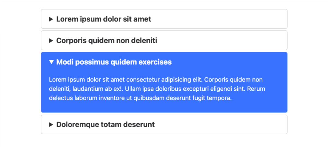
Thats it! Job done! Our CSS only accordion element is ready.


